Wednesday, 12 May 2010
Monday, 26 April 2010
Thursday, 18 March 2010
Evaluation: How did you use media technologies in the construction and research, planning and evaluation stages


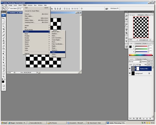


Yet another important technology in the creation of my media product was for the ancillary tasks. This is because I had to use a whole new technology known as Adobe Photoshop. I used this technology for my media product effectively as I used the ability that Photoshop possessed to use different layers to create interesting backgrounds and foregrounds that related to my music video and therefore created a package that went together. The main effects however that I used to create my media product in Photoshop were the filters I could apply to the images I used. Some of the filters that I used were the twirl filter and other distort effects. Among these effects I was able to use the variety of patterned backgrounds to quickly create interesting designs for my ancillary tasks, such as the chequered background which again related to the design of entire media package.
Evaluation: How did you use media technologies in the construction and research, planning and evaluation stages

Another one of the technologies I had to use was the internet website Blogger. This is an extremely important technology as all of our progress to our music video was to be recorded on this website. I feel that I have used this technology very effectively and efficiently as I was able to use all the features available to the website, such as the ability to embed videos from YouTube and to include images to help portray what I am describing in my text. However, more work can be done to improve my blogs as more images and videos could be used more often to break up the amount of text.
Evaluation: How did you use media technologies in the construction and research, planning and evaluation stages
Another important technology that I had to use during my media product was the use of the camera. This was an extremely important technology as it was needed to film all of the footage for our music video. In conjunction with the camera I used the tripod in an attempt to create more and interesting shot types and angles to add variety to my music video. The camera is a technology that I have used before but I needed to use again but in a different way due to the different requirements.
Evaluation: How did you use media technologies in the construction and research, planning and evaluation stages
During the creation of my media product I have had the option to use many different types of technologies that were essential in creating an effective music video. One of the most important technologies that I have used was Final Cut express. I used Final Cut effectively by using a vast range of the effects available on the editing software such as the effect strobe and the effect colour corrector to improve the footage that I had already filmed. The most efficient ability that Final Cut offered is the ability to overlay tracks of footage so that you can reduce the size of the clip easily. It also meant we could have clips on different layers so that we could have the footage of the band singing throughout the video as a constant, instead of continuously synchronising the clip and the sound. Another important feature of Final Cut that I utilised is the ability for Final Cut to use the effect Chroma Key. Although I did not use this effect to any great lengths I did attempt to use it within our music video because it is such a valuable effect. However, during the circumstances of the music video, I did not work due to large differences in colour.
Evaluation: What have you learned from your audience feedback?
Another improvement that was offered from the target audience was related to the depth of shots. This is because they enjoyed the shots featuring the instruments being played and the literal meanings of the lyrics, but felt they were lacking in comparison to the amount of the video that was made up of the recording studio. This was a very important comment as we felt our video was lacking substance but did not know what it was lacking, until the audience feedback. This is very significant because it is an opinion that has been shared with others when we have received audience feedback. Overall, from our audience feedback session, we have discovered that we have targeted our audience effectively due to the use of bright colours and effects highlighted by the audience, but need to improve the variety of the music video as some of the shots last too long and become boring. Therefore, we have learnt what needs to be done to improve our music video from the audience feedback.
Evaluation: What have you learned from your audience feedback?
There were however, responses towards the music video that were not so positive, but were constructive. The audience felt that the way to improve the music video was the way the band interacted throughout the video along with their image. The audience felt that the artists interacted with the audience on occasions when they were moving around acting ‘Mad’ but did not do it enough in this school environment. They also felt that even though they could tell who the artists were in the band, they felt that the artists could appear more like a pop star, as that is the image they received from the bright colours.
Evaluation :What have you learned from your audience feedback?
From my audience feedback I have learnt many things on how to improve my music video. This is because we used people from our specific target audience, featuring teenagers aged 14-18, to maximise the quality and usefulness of the feedback we received. Some of the comments that were made were positive. For instance, the audience appreciated the change in colours when Sheriece was singing during the music video. The audience felt that the colours suited the style of the music and the tempo because it is a quick, energetic song, similar to the feeling that bright colour of pink and green make. Another positive of our music video is the use of opacity during the shots of the recording studio. The reason why the audience liked this effect is because it allowed for a constant image to go through whilst other parts of the footage changed. The audience also felt that the use of the opacity and overlays helps the music video flow from shot to shot which contrasts to the music and the sharpness of the lyrics.
Evaluation :How effective is the combination of your main product and ancillary texts?


Another way in which the media package has combined effectively to create the image of the band is through the themes within the music video. For instance, I carried on the theme of the chequered squares in the ancillary tasks with a chessboard on the back of the DVD cover. Another theme that was carried through from the music video was the idea of shadows. The idea of using shadows in the music video and the ancillary tasks is that it connotes that the band has modernised the genre to the point where it is only a shadow of the past. However, I have not developed the idea so much that it reached the point where the music was also a shadow of the genre and that the band have created an entire new genre. This is an example of excellent and effective combination of the music video and ancillary tasks. This is because I have used the idea of shadows in both the music video and ancillary task to show that it was not just a random idea in the music video, but a symbol of the modern Ska band that still plays the same style of music. This was shown simply through the combination of the music video and ancillary task, not just through the shadows, but also through the female band and through the use of colour. Overall, my main product has effectively combined the music video and ancillary tasks.
Evaluation :How effective is the combination of your main product and ancillary texts?
This philosophy of being different has been portrayed through the use of colour. This is because the Ska genre typically does not use a great deal of colour and focuses rather on the music than the image of the band. We showed this but through the use of the colour. Using bright colour is in our music video and ancillary tasks have reinforced the idea that the band is all female and it suggests that the band is more interested in the image rather than the music. This is what we wanted to create through effectively combining to use of colour in the media package. This combination is effective because when they see the band and its image they see it is modern compared to other bands of the same genre, however, through the same package we have exaggerated the idea of colour and feminism to the point where the band are ridiculing critics and conservatives of the genre for judging them on being femine and the stereotypes related. This combination of colour has therefore proved to be effective in creating the image of the band in a different and unexpected way.
Evaluation :How effective is the combination of your main product and ancillary texts?


The idea of a digital pack features both a music video and ancillary tasks that all revolve around the band and their image. The combination of the two is difficult to achieve, however, through the creation of the music video prior to the ancillary tasks, I have created many ideas that could feature as the image or the symbol of the media package. Firstly, within the music video the idea of female artists helped create a starting point for the ancillary tasks as I had to portray the fact they are female, because that is the image of the band. Doing this helped combine the music video with the ancillary task because it linked the fact that the band are female with the music video and the work they are doing, to the publishing, which was effectively what the ancillary tasks were doing. It was important to combine the idea of the band being female within the music video and the ancillary tasks because it creates a message that the band takes risk. This combination is effective as it shows the band is willing to take risks and is also effective because it demonstrates the bands philosophy of being different and not caring, which has also been captured through the music video and ancillary tasks in a different way, the use of colour.
Evaluation: In what ways does your media product use, develop or challenge forms and conventions of real media products
My media product has also challenged conventions of the Ska genre through the music video because we did not show the band performing as much as there has been in the genre or as much as Madness’ version of ‘Baggy Trousers’. Instead we experimented with animating the lyrics so that the bands perform the exact actions or events that the lyrics say. We also experimented with the idea of stop animation which has never been used before in the Ska genre. This is not only breaking conventions, as we did not do what the genre traditionally does, but also developing the genre as it offers a foundation for future Ska bands to something different to similar to our band, continuing to reform the genre and expectations.
Evaluation: In what ways does your media product use, develop or challenge forms and conventions of real media products

Another way in which my media product challenges conventions of the Ska genre is through the image of the band. This is because although there have been female members of Ska bands before, such as with the Skalars, there the genre has never featured women on a mass scale due to the dominant presence of males. Therefore, we tried to break this idea by using an all female band within the 2-Tone Ska genre. This would modernise the genre and continue to break conventions as it is expected for a male band to feature with that style of music. This breaking of conventions through female artists relates to the bright colours as women are often stereotyped to prefer the ‘feminine’ colour of pink and purple that feature in my music video and ancillary task. This is developing conventions of the genre because it features an all female Ska band that would inspire others to do the same and completely re-shape the image of the genre, reforming it.
Evaluation: In what ways does your media product use, develop or challenge forms and conventions of real media products
There are several ways in which my media product challenges as well as develop conventions of real media products. Firstly, my media product challenges conventions of the Ska genre through the use of bright colours. This challenges the conventions because traditional forms and conventions of the Ska genre, specifically 2-Tone Ska, do not use bright colours and continuously keep to a black and white colour trend. Although colour is used, we developed the idea by adding more colour to exaggerate the idea and show how our band is modernising the genre away from its old roots, so that it will appeal to a modern audience dominated by mass genres such as popular music.
Monday, 15 March 2010
Re-shoot film club
After deciding to re-film in Film club we set about organising the room. We decided we would set up the room in a traditional format of arranging the chairs and tables in 3 lines. Then we spoke to the students and told them were to sit in the room. After filming them sitting down in one location, we asked them to move to another sit and then filmed them doing this including the movements around the room. We left the camera in a high angle and long shot so that we could see the entire students move around the room. We repeated this several times before we felt we had enough footage. Following on from this we decided that we were going to film the students from the same shot sitting down one at a time so that when we play the selection of shots backwards it will look as though the students have ‘gone away’ as the lyrics suggest. Once again from the long shot and high angle we filmed the students sitting down at the tables. But this time we had Sheriece and Stacey, who are the lead singers, appear next to the students messing around and having a laugh, trying to reconstruct the persona of the band, which is that they are crazy, which is referenced in our music video but not fully shown to the audience as the peer feedback stated.
Audience Feedback
We carried out some audience feedback to receive positive feedback on our music video along with constructive criticism to help us understand what needed to improve in order to make the music video reach a higher standard on the basis of our target audience’s opinions’.
Age Range of audience questioned- 14 to 18
Gender- Male and Females
Audience Feedback was given through what worked effectively with our Music Video (WWW) and what could we improve on in our Music Video (EBI).
WWW
![]() Changing Colours Sequence
Changing Colours Sequence
![]() Lyrics Matching Footage
Lyrics Matching Footage
![]() Opacity of shots in the recording studio
Opacity of shots in the recording studio
![]() Colour Borders
Colour Borders
EBI
![]() More Checkered Transitions
More Checkered Transitions
![]() More Audience Interaction
More Audience Interaction
![]() Improve the ending- timing of the puzzle
Improve the ending- timing of the puzzle
![]() Used more of the lyrics to match the footage
Used more of the lyrics to match the footage
![]() Dance move throughout video
Dance move throughout video
![]() The name of band and title needs to be bigger
The name of band and title needs to be bigger
![]() Re-record in the recording studio- lighting needs improving
Re-record in the recording studio- lighting needs improving
![]() Need to look more like a ‘popstar’
Need to look more like a ‘popstar’
![]() More instrument shots.
More instrument shots.
Our Audience Feedback session made us aware that our target audience of female teens was shown through the video, as they felt we were targeting the correct audience.
Plan to re-shoot
My group and I decided during the half term day that we were going to re-film two parts and possibly a third. The first part was going to be done Sheriece and Stacey as we only needed them for the filming. In this case, they were to be filmed do crazy things around the school similar to before, but more depth to the footage so they we could have a wider range of shots to fit the persona and image of the band.
The second part that was going to be filmed was after during the schools’ film club. The reason we chose to film then was because we could use the classroom to fit the school image and the students who turned up to play the role of the many kids that are in the school. This footage will feature as the literal meaning of the lyrics when the song goes ‘all the kids have gone away’. This will allow us to use more stop animation to make it appear as if the students is just disappearing, which will fit with the ideas already incorporated in the music video.
The third part we were planning to re-film was the parts where the band plays the instruments. Although the footage we filmed had good shots and looked good within the music video, my group and i felt that the footage was not substantial enough and we could have a few more shots to break up the pattern of the band playing.
Second Shooting Schedule
Reconstruction and improvements to music video
My group and I spent time reconstructing and improving our music video based on what we could remember from our old music video and the storyboards we created. Although the storyboards were not as accurate as they were because we developed our ideas as we went along, we used it as a reminder of our original ideas.
We began by importing all of the shots we had filmed over the course of the project. This took a long time as we had three tapes to import but we also understood that we needed all of the footage before we could successfully improve our music video and reconstruct what we had lost. We also knew that we had the whole day to make drastic changes to our music video and so did not panic.
Once all of the footage had been uploaded we began filling in the gaps in the music video. We started with the biggest gap because of its size. We did not remember fully what went in that gap but knew it contained shots of the head teacher being lazy and acting as a student, as well as the members of the band acting mad to fit the persona of the band within the music video.
Having filled in the gaps the best we could on memory we worked on improving as much as possible for the music video. One of the ways we tried to improved the music video was through an effect that made the moving image of the lead singer dancing appear similar to stop animation or as if it is buffering. This effect was called strobe. It was really effective because it fit in with the sharpness of the music and the ideas already used in the music video; therefore we decided we would use more of it in appropriate places.
Recovery of missing work
The media technician Mr winters decided to help me by breaking down what clips were actually missing so that when we imported again, as long as we imported the same way as before, then the clips would be created with the same start and end points as before. However, in doing so we exported that Final Cut project to determine how much was actually missing. In doing so, we recovered clips for reasons unknown to us. We decided to continue to search the old servers but decided our best bet was now to complete the music video based on what we recovered and the re-imported clips.
Recovery of missing work
I went along again to see the It technician in order to continue to find our missing work. However, once again our efforts were futile as we did not manage to find any more clips within the restored work from the old server.
Recovery of missing work
I went along to see an IT technician in order to see the copy of the media server from the last time that it was backed-up. This meant that the clips should have been there in our folder. However, for reasons unknown the capture scratch of our clips was still missing even from before the Christmas break. Therefore we had to search through the old server in attempt to locate some of the clips, where we managed to locate 7 clips.
Missing work
During our coursework, we encountered a rather significant dilemma, due to unfortunate circumstances where our capture scratch was inconveniently deleted. This hindered our progress as we could no longer continue editing as most of the media clips were ‘offline’. This meant we had to plan with the media technician how we were going to recover our missing work.
Tuesday, 23 February 2010
Digital pack 17


Having finished the whole of my digital pack to its entirety, I collapsed all the layers on the front, back and spine. Afterwards I proceeded to place them all onto one full size canvas that reflected the true nature of a DVD cover.
Digital pack 16
I began the changes to my work by starting with the spine. I decided to create a black background with white squares along with the black background to create the chequered image. Afterwards I added the text of the DVD spine. Then I changed the colour of the words so that the words on the black background changed to white and the words on the white background change to black. This proceeded with the theme of black and white in the digital pack and the music video. I then proceeded to make all the remaining changes from my peer review.
Digital pack 15
In this lesson I received peer review on the work I had done so far and the comments I received were to add more colour to the advert and to include the title of the DVD to the front cover. I also had to complete the spine for the digital pack.
Digital pack 14
I continued work on the advert by adding the images of the band. Firstly, I decided to create the wall as there were no walls around to take images of that would have created the desired effect. I created the wall by using the chequered background but with each individual square at its maximum scale. Then I coloured the squares with a darkish red colour that resembled a brick wall colour. Then I went and used the effect called texturiser to make the wall look grainy like bricks.
Having done this I used the images of Sheriece that I took to put on the wall. However, I first removed the colour of the images by messing around with black and white settings. Once this was done I then gave each image an outer glow that was a jelly blue colour. This allowed the images to stand out from the wall. I then flipped some of the images so that wall layout along with the advert was symmetrical. Afterwards I included the details of the DVD release on to the wall of the advert.
Digital pack 13
This time I decided to start work on the advert as I had yet to start work on it. I did this by beginning with the title of the band. Firstly I needed a font and thus went to the website daFont. Having selected the font I was going to use I created a text box on my blank canvas and created the title of the advert.
After creating the title I began work on the background for the advert. I did this by looking at the gradients of the pattern designs. The gradient I was most interested by was the radial one. This was because when I experimented with the colours, the black and white colours created a target in the centre of the canvas. Although this was not linked to my original idea for the advert, my new idea for my advert was more related to the idea of the band being ‘mad’.
The new idea that I had created was that the band would stand on a wall in front of the target as if they are human targets. This would then connote that they are targets of the media at first because they are breaking conventions. However, since the artists would be standing on the wall it shows that they will take the criticism and prove to everyone that they are modern artists.
Digital pack 12
Having completed the front cover I began finishing the back cover. I did this by adding all the unique data that needed to be added to make the CD cover official. This included the barcode, the publisher’s logo, the copyright details and the DVD logo.
Digital pack 11
Having finished the inside cover I decided to return to the background for my front cover. Since I had already used the chequered square idea for the title, I thought that if it was used again then the effect would wear thin. As a result I decided to experiment on the background by using the templates already available. The template I decided to use reminded me of a jigsaw puzzle but wasn’t a mass number of jig saw pieces. Once the background was inserted and moved so that it was the bottom layer, I added colour to the background using only bright colours. Despite doing this, I decided to leave lots of white spaces to resemble that our band was modernising Ska, as shown by the colour, but also keeping to the roots of the Ska genre, as shown by the white.
Digital pack 10
Although I thought my inside cover worked well as an ensemble with the rest of the digital pack, I strongly believed that the inside lacked colour to fully merge into my designs. Therefore I decided to add an outer glow to the spirals. At first I tried a jelly blue colour. However, this did not work with the background and failed to make the spiral stand out at all. After several other colours did not work I tried a vivid green colour. This immediately stood out against the black background and as a result I extended the idea of black and white squares to create black squares with green lines. I achieved this by using the brush tool on a moderate size so that the lines would stand out.
Digital Pack 9
Upon reflection of the design of my inside cover originally, I decided that the idea was basic and needed to be changed. However I did not know where to begin, so I started with the background and used the chequered background idea gain to have a constant theme throughout the digital pack. Once the background had been created I use some effects to distort the background to make it more interesting. The effect I used was under distort, and was the twirl effect. This changed the background into a large white swirl with a black background. This effect worked well with the composition of work I did so far so I duplicated the layer and made two smaller swirls so that the inside cover was denser.
Digital Pack 8
Having already started the back cover I had decided to continue working on the back cover as I knew more needed to be done on it. This time I finished using the magic wand to remove the background of the pieces and I placed them in specific locations on the computerized chess board so that the song titles could be placed in positions where there was not a chess piece. After doing this I added the song titles in the album using the text box tool and changed the colour of the font so that if it was on a white square the text was back and if it was on a black square the text was white. This would ensure that the titles could be read on the background; otherwise the process would have been futile.
Digital Pack 7
In this lesson I began looking at the criteria and noticed that I had to show clear and excellent use manipulating images in Photoshop. Having also looked through my music video for more ideas of what I could focus my back cover on I reflected on the use of the chequered squares and pondered how I use that idea to show the breaking of conventions that our band want to represent. After creating an idea of using a chess board as the back cover I went and found a chess board and pieces and took several images of the board and the pieces. After importing these images into Photoshop I began deleting the background of each unique piece using the magic wand tool and by creating the chequered background on a blank canvas, using the preset pattern designs.
Digital Pack 6
When I worked on the computer this time and began working on the back cover for digital pack. However, having already played around with Photoshop I had decided that my original design would no longer work. Therefore I began by creating a format for the titles of the song. After a short brainstorm I decided to have the songs in a crossword format. Once I had created the layout for the foreground I immediately saw that it did not work with the front cover I had already created and I began brainstorming more ideas for the back cover.
Digital Pack 5
In this lesson I spent time finishing the title at the beginning by mirroring the title so that it looks like a reflection. I did this by using the same method of the magic wand and the paint bucket tool, but instead of making each square black, I added colour to the title by using a mixture of several colours. This was done as I wanted to use the addition of colour as a symbol of how modern our band is relative to the Ska genre, by showing we are breaking conventions.
After I completed the title I began working on the foreground for my front cover. I decided to use the idea I had designed originally of the images of shadows by I decided to contrast the shadows and the black title, with the colourful title and brighter images. This contrast of colour would also help convey that our band is breaking conventions showing that it is a modern band by breaking the idea of 2 Tone Ska being black and white.
I created the foreground by using 2 images. The first image was of Sheriece and the other was of Stacey. With the first image I duplicated the layer and used the original layer and flipped it horizontally. This was so that the images were both on the correct plane relative to the title. I did the same method with the second image however after duplicating the image three times I flipped two versions of the image. This was so that two images were next to the first image making the framing of the foreground excellent.
Digital Pack 4
In this lesson we started using the Mac computers for the first time and I began by creating the canvases for all the sections of the digital pack. Once all the canvases had been created and saved I began work on the title for the front cover. I did this by inserting the chequered style background and cropping to the section that I wanted to place the title. I then created the title by using the magic wand tool to select each individual square so that I could then use the paint bucket tool to fill in each individual square a black colour so that it spelt out the bands names.
Research and Planning: Digital Pack 3


In this lesson I decided to finish the work I had done on the front and back covers by including the locations of the barcode, copyright and publisher details in the design. Afterwards I designed the location of the song titles and created my own song titles for the back cover. along with finishing my front and back cove rI cimpleted my inside cover and my advert.
Research and Planning: Digital Pack 2
I began the research for my advert and decided that I would use the jigsaw theme as it could then relate to my front cover. I plan to use an incomplete jigsaw as my template and then have some images of Sheriece as shadows above the template. However, I also plan to have the quotes and reviews of magazines and papers within the jig saw pieces along with the details of the album and the band.
Research and Planning: CD covers

This CD cover inspired me in my planning for the ancillary tasks because the lack of colour highlighted the need for new modern Ska bands to express themselves. It also helped highlight the attraction needed for the target audience, therefore I knew I had to use lots of colour much like with the music video.
Another CD cover that inspired me were the ones completed by past students. Although their work was not professional the ideas were based on research from professional covers, and the idea of using recurring themes from the video link the package together effectively. This was evident through professional music videos and packages that use a recurring theme or symbol, and therefore I wanted to stick with this convention.

In this example Jay Zs cover uses the idea of the three red stripes, which is featured in the rest of the media package as a symbol for the album and the artist. Although in my case I do not have a particular symbol to use, I could use ideas in my music video such as chequered squares or the jig saw pieces.
Research and Planning: Photoshop tutorial


We were given a tutorial of how to use Photoshop by the technician Mr Winters. He showed us how to import images and use the magic wand tool to select and remove sections of the image. He also completed other things.
Research and Planning: Digital Pack 1
I began creating the idea for my music video’s DVD front and back cover. I focused my idea around the idea of chequered squares and jig saw pieces. I felt that these were the more effective parts of the music video as they stood out against the band playing and the stop animation. However, I did not believe that this was enough for either the front over or back cover. So I also went with the idea that our band was breaking conventions of Tone Ska because in our music video we did not only use black and white but used an effect called colour corrector so that the colour on the screen changed constantly. This breaking of conventions is important and needed to be portrayed in the DVD cover as well as the music video.
